Note
Go to the end to download the full example code
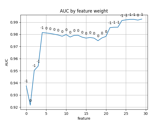
Plot the AUC curve
An example plot of the auc as a function of features
curve for CalfCV on the breast cancer dataset.
When a feature is considered and the auc declines, that feature is dismissed by receiving
a weight of zero. The labels above the plot line are the feature weights.
Author: Rolf Carlson, Carlson Research LLC, <hrolfrc@gmail.com>, License: 3-clause BSD
import matplotlib.pyplot as plt
from sklearn.datasets import load_breast_cancer

from calfcv import CalfCV

X, y = load_breast_cancer(return_X_y=True)
cls = CalfCV().fit(X, y)

xs = range(X.shape[1])
fig, ax = plt.subplots()
ax.plot(xs, cls.best_auc_)

ax.set(xlabel='feature', ylabel='AUC',
       title='AUC by feature weight')

ax.grid()

# zip joins x and y coordinates in pairs
for x, y, z in zip(xs, cls.best_coef_, cls.best_auc_):
    label = f"{y}"

    plt.annotate(label,
                 (x, z),
                 textcoords="offset points",
                 xytext=(0, 10),
                 ha='center')

plt.show()
Total running time of the script: (0 minutes 0.754 seconds)